Social Media
Web design
Branding
Graphic design
Social Media
Web design
Branding
Graphic design
Building a Brand System for a Multi-Market Solar Company
Building a Brand System for a Multi-Market Solar Company

Roll:
Senior Designer
Client:
Cresta
Tools:
Figma, Adobe Creative , Framer
Timeline:
5 years
5 years rebuilding a fragmented brand system that now feeds lead-gen campaigns generating 5,500+ leads. Prosolar Systems is a solar energy company operating across multiple franchise markets in the US and Caribbean, California, Florida, Puerto Rico, St. Thomas, and the Caribbean.
5 years rebuilding a fragmented brand system that now feeds lead-gen campaigns generating 5,500+ leads. Prosolar Systems is a solar energy company operating across multiple franchise markets in the US and Caribbean, California, Florida, Puerto Rico, St. Thomas, and the Caribbean.
5 years rebuilding a fragmented brand system that now feeds lead-gen campaigns generating 5,500+ leads. Prosolar Systems is a solar energy company operating across multiple franchise markets in the US and Caribbean, California, Florida, Puerto Rico, St. Thomas, and the Caribbean.


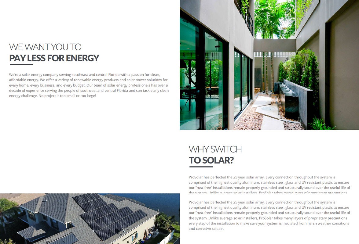
Old website
The Challenge
The Challenge
Solar energy company across 5 US and Caribbean markets, no unified visual system after 5 years of growth
Inconsistent color, a logo that didn't scale, no typography standard, no shared guidelines
Every franchise communicated differently, undermining trust and recognition
Solar energy company across 5 US and Caribbean markets, no unified visual system after 5 years of growth
Inconsistent color, a logo that didn't scale, no typography standard, no shared guidelines
Every franchise communicated differently, undermining trust and recognition
Key decisions
Key decisions
The logo
Rebuilt for real-world use: safe zones, misuse rules, icon and app versions
Color:
Built a green-to-blue gradient around one idea, sustainability meets technology, working from van wraps to social icons
Typography
Chose Poppins for technical clarity, built a secondary decorative system for campaigns without breaking consistency
Photography:
Grounded the brand in real installations per market instead of stock photography
The logo
Rebuilt for real-world use: safe zones, misuse rules, icon and app versions
Typography
Chose Poppins for technical clarity, built a secondary decorative system for campaigns without breaking consistency
Color:
Built a green-to-blue gradient around one idea, sustainability meets technology, working from van wraps to social icons
Photography:
Grounded the brand in real installations per market instead of stock photography
The logo
Rebuilt for real-world use: safe zones, misuse rules, icon and app versions
Color:
Built a green-to-blue gradient around one idea, sustainability meets technology, working from van wraps to social icons
Typography
Chose Poppins for technical clarity, built a secondary decorative system for campaigns without breaking consistency
Photography:
Grounded the brand in real installations per market instead of stock photography
Visual Design


Social Media Post
An Instagram content system built as a brand narrative arc, not standalone posts, including real trekking and kayak data cards from the surrounding area.
An Instagram content system built as a brand narrative arc, not standalone posts, including real trekking and kayak data cards from the surrounding area.


Website
Designed around the customer journey: who they are, real projects, financing options, testimonials, conversion. Separate landing pages per service, full brand system applied digitally.
Designed around the customer journey: who they are, real projects, financing options, testimonials, conversion. Separate landing pages per service, full brand system applied digitally.
The Result
A complete brand system capable of scaling across markets and franchise locations, with documented guidelines any team could follow independently. Once the new identity and messaging were in place, the lead-generation campaigns built on top of it drove 5,500+ leads across two Meta campaigns, proof that clearer communication didn't just look better, it performed better.
A complete brand system capable of scaling across markets and franchise locations, with documented guidelines any team could follow independently. Once the new identity and messaging were in place, the lead-generation campaigns built on top of it drove 5,500+ leads across two Meta campaigns, proof that clearer communication didn't just look better, it performed better.


More projects




© 2026 PERSONAL PORTFOLIO | ALL RIGHTS RESERVED
© 2026 PERSONAL PORTFOLIO | ALL RIGHTS RESERVED
© 2026 PERSONAL PORTFOLIO | ALL RIGHTS RESERVED