Brand Identity for a Plant-Based Dining Concept
Year :
2025/26
Industry :
gastronomy
Client :
ModoMIo
Bases:
Milan, Italy

The concept
MODOmio is an itinerant plant-based dining experience built around "Mesa de Domingo", a slow, seasonal Sunday lunch format that brings together Italian culinary tradition and Argentine warmth. The experience travels: guests gather in private homes, agriturismos, and unique spaces, never the same place twice.
The design challenge
The brand needed to attract two very different audiences simultaneously: guests who want to attend, and hosts who want to offer their space. Each has a different emotional need. The visual identity had to speak to both without losing coherence.
Key decisions
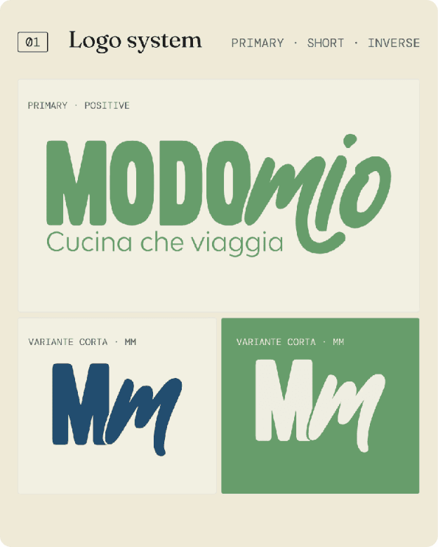
Logo: Bold condensed "MODO" paired with organic script "mio", a deliberate typographic tension. Structure meets warmth, precision meets spontaneity. The duality of the concept in one mark.
Color palette: Earth tones: gold, sage green, navy, near-black. Grounds the brand in food, nature, and intimacy without falling into generic plant-based clichés. Works equally on a printed flyer and on screen.
Slogan: Cucina che viaggia, three words that explain the entire format without describing it literally.
Web: Built in Framer around the two audiences, each with their own entry point and narrative flow. Hosts and guests land in different emotional territories within the same site.
Collateral: Outreach materials designed for direct venue prospecting, flyers taken in person to restaurants and spaces. Design that works at human scale, without a screen.
Illustration system: Custom hand-drawn style, hands, glasses, pasta, vegetables, giving the brand warmth and specificity that photography alone couldn't achieve.
Branding:


Illustration system:

Website:
Social Media


Stories