Social Media
Social Media
Web design
Web design
Branding
Branding
Graphic design
Graphic design
Building a brand from scratch: naming, visual system, and digital product
Building a brand from scratch: naming, visual system, and digital product
Roll:
End-to-end web designer
Client:
Cresta
Tools:
Figma, Figma Sites, Figma Motion
Timeline:
April — July 2026
Cresta is an end-to-end brand identity project for a trekking and food experience retreat in Lorsica, Italy. I led the process from naming through a launch-ready digital product: brand concept and naming (developed trilingually in Spanish, Italian, and English), logo and visual identity, a contextual color and typography system, brand content (menus, experience packages), UX for a full booking flow, and a website designed.
Cresta is an end-to-end brand identity project for a trekking and food experience retreat in Lorsica, Italy. I led the process from naming through a launch-ready digital product: brand concept and naming (developed trilingually in Spanish, Italian, and English), logo and visual identity, a contextual color and typography system, brand content (menus, experience packages), UX for a full booking flow, and a website designed.
Cresta is an end-to-end brand identity project for a trekking and food experience retreat in Lorsica, Italy. I led the process from naming through a launch-ready digital product: brand concept and naming (developed trilingually in Spanish, Italian, and English), logo and visual identity, a contextual color and typography system, brand content (menus, experience packages), UX for a full booking flow, and a website designed.

Research
Research
The moodboard went through several rounds of correction: early references leaned too editorial (glossy hands, plated fine-dining food), far from the "premium but homemade" feeling the brand needed. The final board settled into three threads that coexist: the physical (mountains, trails, worn boots), the social (long tables, cards, laughter), and the sensory (water, texture, hands), all in the same warm, unposed register.
The moodboard went through several rounds of correction: early references leaned too editorial (glossy hands, plated fine-dining food), far from the "premium but homemade" feeling the brand needed. The final board settled into three threads that coexist: the physical (mountains, trails, worn boots), the social (long tables, cards, laughter), and the sensory (water, texture, hands), all in the same warm, unposed register.
Cresta is where the climb ends and the view begins. A place in the Ligurian mountains where you climb, you enjoy, and you arrive at a long table. Care in what's simple: surrounded by nature, home-cooked food, people who don't need an introduction to sit down. Cresta isn't for someone looking to escape the world, it's for someone looking to meet others in it.
Cresta is where the climb ends and the view begins. A place in the Ligurian mountains where you climb, you enjoy, and you arrive at a long table. Care in what's simple: surrounded by nature, home-cooked food, people who don't need an introduction to sit down. Cresta isn't for someone looking to escape the world, it's for someone looking to meet others in it.
Visual Design
Visual Design
Four distinct people, each needing something different within seconds of arriving:
Four distinct people, each needing something different within seconds of arriving:
The logo
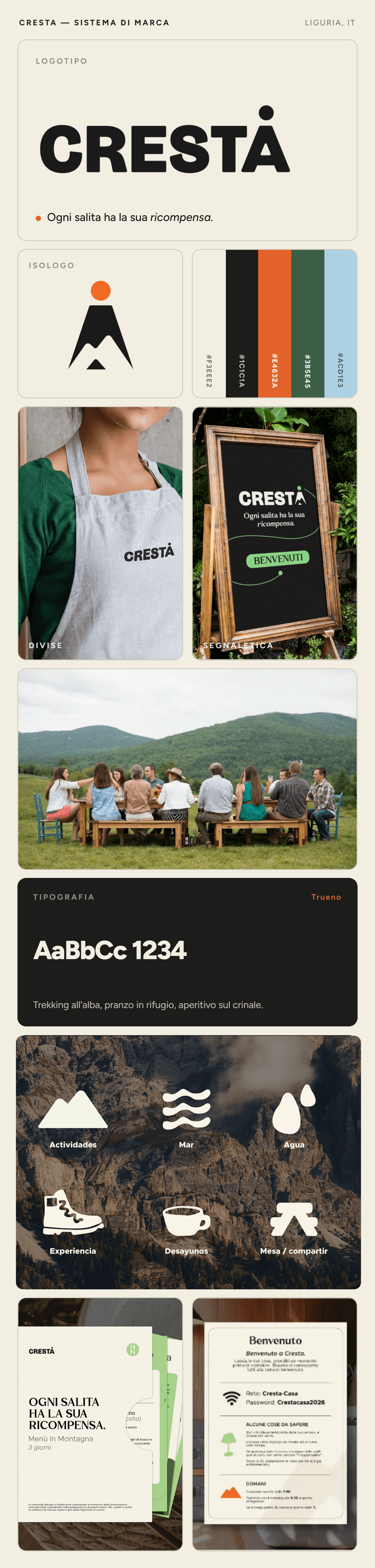
The final version resolves all of that in one move: a triangle of three asymmetric peaks, unambiguous at a glance, topped with a solid dot marking the arrival at the ridge, built with the same stroke weight as the wordmark's letters, so the mark and the type read as a single piece.
Color:
Primary: cream (background) and charcoal black (type and logo) Secondary: dark green, for contrast blocks Accent: orange, used sparingly, never as a large surface
Typography
Trueno for headlines and the wordmark, Metropolis for body copy, a serif reserved exclusively for the tagline, and Mebezt as a punctual accent for short, highlighted headlines.
Secondary icons:
A system of solid (filled, not outlined) icons drawn from the same geometric language as the mark, giving each brand pillar its own symbol (trail, wave) instead of forcing the mountain to represent everything.
The logo
The final version resolves all of that in one move: a triangle of three asymmetric peaks, unambiguous at a glance, topped with a solid dot marking the arrival at the ridge, built with the same stroke weight as the wordmark's letters, so the mark and the type read as a single piece.
Color:
Primary: cream (background) and charcoal black (type and logo) Secondary: dark green, for contrast blocks Accent: orange, used sparingly, never as a large surface
Typography
Trueno for headlines and the wordmark, Metropolis for body copy, a serif reserved exclusively for the tagline, and Mebezt as a punctual accent for short, highlighted headlines.
Secondary icons:
A system of solid (filled, not outlined) icons drawn from the same geometric language as the mark, giving each brand pillar its own symbol (trail, wave) instead of forcing the mountain to represent everything.
The logo
The final version resolves all of that in one move: a triangle of three asymmetric peaks, unambiguous at a glance, topped with a solid dot marking the arrival at the ridge, built with the same stroke weight as the wordmark's letters, so the mark and the type read as a single piece.
Typography
Trueno for headlines and the wordmark, Metropolis for body copy, a serif reserved exclusively for the tagline, and Mebezt as a punctual accent for short, highlighted headlines.
Color:
Primary: cream (background) and charcoal black (type and logo) Secondary: dark green, for contrast blocks Accent: orange, used sparingly, never as a large surface
Secondary icons:
A system of solid (filled, not outlined) icons drawn from the same geometric language as the mark, giving each brand pillar its own symbol (trail, wave) instead of forcing the mountain to represent everything.

Social Media Post
An Instagram content system built as a brand narrative arc, not standalone posts, including real trekking and kayak data cards from the surrounding area.
An Instagram content system built as a brand narrative arc, not standalone posts, including real trekking and kayak data cards from the surrounding area.


Branding
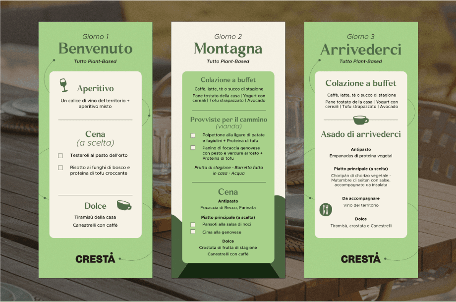
Kitchen: a plant-based philosophy that isn't a banner to wave, it's simply how the kitchen runs here. Menus structured by experience and by day, with traditional Ligurian dishes reinterpreted in plant-based form.
Experiences: three multi-day packages (Mountain + Sea, Express, In the Mountains), each with a full itinerary, what's included and what isn't, and complete operational policy content (travel insurance, physical difficulty, cancellation, weather) treated as real product, not fine print.
Kitchen: a plant-based philosophy that isn't a banner to wave, it's simply how the kitchen runs here. Menus structured by experience and by day, with traditional Ligurian dishes reinterpreted in plant-based form.
Experiences: three multi-day packages (Mountain + Sea, Express, In the Mountains), each with a full itinerary, what's included and what isn't, and complete operational policy content (travel insurance, physical difficulty, cancellation, weather) treated as real product, not fine print.


Website
a full site designed in Figma and published on Figma Sites, with a 5-step booking flow designed as UX first (details, health questionnaire with a conditional branch, summary, insurance and waiver, payment).
a full site designed in Figma and published on Figma Sites, with a 5-step booking flow designed as UX first (details, health questionnaire with a conditional branch, summary, insurance and waiver, payment).


More projects




© 2026 PERSONAL PORTFOLIO | ALL RIGHTS RESERVED
© 2026 PERSONAL PORTFOLIO | ALL RIGHTS RESERVED
© 2026 PERSONAL PORTFOLIO | ALL RIGHTS RESERVED